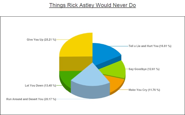
There’s enough bad data visualizations out there to mock publically. Here are some sites that do just that.
- Junk Charts – examples with commentary on how to make improvements. You can also follow @JunkCharts on Twitter.
- WTF Visualizations – a Tumblr blog of “visualizations that make no sense”. You can also follow @WTFViz on Twitter.
Are there other sites that I should list here?


