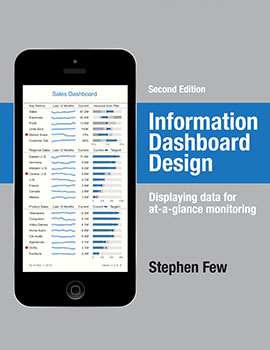
Stephen Few has made significant contributions to the field of data visualization, publishing books like Show Me the Numbers, Now You See It, and Information Dashboard Design. Drawing inspiration from experts like Edward Tufte and Colin Ware, Few has a real talent for bringing theoretical concepts to life in a practical way.
The first edition of Information Dashboard Design, published in 2006, completely changed my approach to building dashboards (see my review of the previous edition). The second edition of Information Dashboard Design (Analytics Press; Second Edition, 2013, ISBN 978-1938377006) is a significant revision and rewrite of its predecessor, with lots of new material. It is a reflection of how the world of data visualization has changed since 2006. None of the data visualization tools available at that time supported Edward Tufte’s sparklines or the author’s own bullet charts. Nor were there Apple iPhones (released in 2007) and iPads (released in 2010) to display analytics. The changes are also reflected in the subtitle, which is now “displaying data for at-a-glance monitoring” instead of “the effective visual communication of data.”
What has not changed since 2006 is software vendors’ pursuit of gaudy impractical visualizations like exploding pie charts (see related article, A Few Words about Data Visualization in SAP BI 4.0).
Without a doubt I owe the greatest debt of gratitude to the many software vendors who have done so much to make this book necessary by failing to address or even contemplate the visual design requirements of dashboards. Their kind disregard for visual design has given me focus, ignited my passion, and guaranteed my livelihood for years to come.
Stephen Few
Acknowledgements for Information Dashboard Design
Although Few is well-known for his disdain of pie charts, his advice is grounded in the science of visual perception. He devotes entire chapters to sparklines and bullet charts. And he provides new guidelines for visualizing data on smartphones and tablets. The chapter “Putting it All Together” provides in-depth analysis of real dashboards submitted for a dashboard design competition. It’s very instructive to see multiple dashboards attempting to meet the same set of business requirements, with varying degrees of success. And the book concludes with “From Imaging to Unveiling,” a short but meaningful chapter about how to design for success. Not only is the content valuable, but the hardcover edition is beautifully rendered in color with high-quality materials.
This is a book about dashboard design- not implementation. It’s not written exclusively for technicians, but anyone who has an interest in bringing useful data visualization to life in their organization. Few’s goal is “eloquence through simplicity” and he achieves it with this new book.
- Purchase Information Dashboard Design on Amazon.com
- See other books by Stephen Few
- Read Stephen Few’s blog on Perceptual Edge web site
Disclosure of Material Connection: I received this book free from the publisher. I was not required to write a positive review. The opinions I have expressed are my own. Some of the links in the post above are “affiliate links.” This means if you click on the link and purchase the item, I will receive an affiliate commission. Regardless, I only recommend products or services I use personally and believe will add value to my readers.I am disclosing this in accordance with the Federal Trade Commission’s 16 CFR, Part 255: “Guides Concerning the Use of Endorsements and Testimonials in Advertising.”


3 thoughts on “Information Dashboard Design, Second Edition by Stephen Few”
Comments are closed.