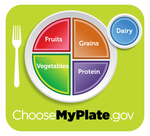
Last week, First Lady Michelle Obama and Agriculture Secretary Tom Vilsack unveiled a new nutrition icon to replace the Food Pyramid- the MyPlate. The visualization is intended to help Americans understand the proper amounts of fruits, vegetables, protein, grains, and dairy that should be in our diets.

But Brian Vastag, science reporter for The Washington Post, had this observation (click here to read full article):
Circular, with four colorful divisions to represent the four main food groups, the new plate looks just like a pie chart [emphasis added] — a description experts shun because, well, pie isn’t good for you.
Brian isn’t alone in thinking that pie charts aren’t good for you. However, I believe a pie chart not only works because of the dinner plate metaphor but because it depicts only four data values. Plus, the slices represent approximate and not precise amounts. The main point of MyPlate is that half of our diet should be fruits and vegetables, but frequently isn’t.
Learn more about the USDA MyPlate at ChooseMyPlate.gov or follow MyPlate on Twitter.
DISCLAIMER: No SAP business intelligence products were used in the creation of the MyPlate.
What do you think of the USDA’s new MyPlate? Think a bar chart would have been as memorable?


Also, it’s gradient. Don’t even get me started on gradient.
I think the plate-to-pie-chart makes perfect sense.
I don’t like the content of that plate, though: you have your fruits, vegetables and grains, all natural, food items that Michael Pollan would approve of. And then you have protein, an ingredient, separate from the rest.
This sends the (wrong) message, that vegetables and grains don’t contain any protein, and that the obviously missing ingredient (meat) is equivalent to protein.
The pie chart makes an excellent visualization.
Bar chart as the growth of skyscrapers per city and line charts
as AKG statistics anyone ? 🙂
There is another thing interesting here
:
Data can also be visualized outside the charts frontiers.
Yoav
The USDA is so far off on everything. We are meat-eaters first and foremost. Top of the food chain and all that. If we were meant to chew vegetables and fruits, we’d have a completely different set of teeth than what we have. Meatitarians UNITE!!!!