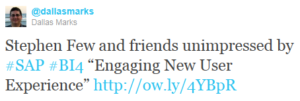
Last week, I tweeted about a recent post on Stephen Few’s blog, a criticism of SAP BusinessObjects Business Intelligence 4.0, was conveniently posted during the week of SAP’s annual ASUG/SAPPHIRE conference.
It’s worth noting that the article was not written by Stephen Few himself, but one of his team members, Bryan Pierce. Honestly, I was a bit nervous making my tweet, as 140 characters doesn’t give much space to convey whether you are agreeing or disagreeing with a tweeted link. And by tweeting in this case, I’m giving free publicity with increased page views to a point of view I disagree with. But another Twitter user shared my sentiments.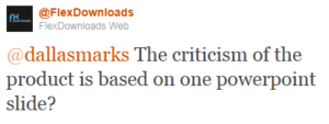
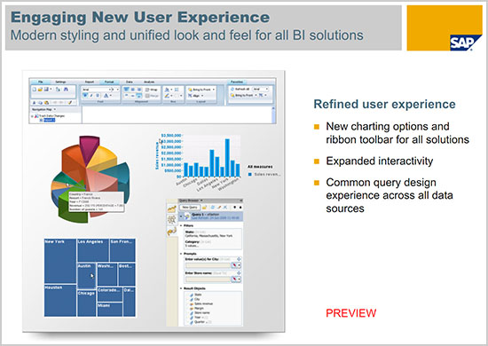
Yep. An article criticizing BI 4.0 based on a marketing slide (shown below) with a dreaded pie chart. An exploding one, even. Here’s the offending slide.
And yes, it is offending. But there are two issues with this kind of reasoning.
First, the product has been judged using a single marketing slide and not a thorough evaluation. Just as we’ve heard of the “death of political journalism“, articles such as this one illustrate a similar death of technology journalism. Looking for on-line eyeballs during a vendor’s annual user conference is not much different than technology web sites trying to get hits for Usama bin Laden’s death. There’s intense pressure to obtain page views at any cost. A ratings bias takes precedence over any editorial bias.
Second, there is always tension between the capabilities of tools and the limitations of the people that use them. In other words, buying a set of expensive chef knives does not automatically qualify me to challenge Bobby Flay on The Iron Chef. Simply removing exploding pie charts from a product like Web Intelligence does not guarantee that I’ll create reports with effective visualizations. Neither does removing bullet points from Microsoft PowerPoint. No matter how many wizards Microsoft includes, I am still perfectly capable of creating ugly and ineffective slides if I don’t think about design.
In “The Presentation Secrets of Steve Jobs“, author Carmine Gallo reveals that you never see bullet points in a Steve Jobs presentation. And in “Information Dashboard Design“, Stephen Few encourages us to avoid pie charts, exploding or not, in favor of more effective visuals. We need books like this (and the experts who write them) to help us create our best work.
But we don’t need product reviews based on PowerPoint slides.
Interested in better visualizations and better business intelligence products? Join the engaging dialog unfolding in the comments of Perceptual Edge’s blog post, SAP BusinessObjects 4.0’s “Engaging New User Experience”.
I myself gave Stephen a few page views in this fiasco. After interacting with him briefly I’ve confirmed what I’ve always sort of thought. He (largely) knows how to convey data, but he has no idea how to communicate effectively. And he’s sort of pompous.
I agree with Jamie about the pompous part. While I agree with most of Stephens design recommendations I have always disagreed with the way he goes about trashing products by picking one page from a marketing slide and saying ‘if this all they can show in training or marketing they obviously have no concept about visualization’.
FWIW, my comment on Stephen’s blog (pointing out where he could get a free download of the current release) didn’t even get past moderation 🙂
If what you are marketing isn’t what you’re selling then isn’t that more of an issue?