Everyone’s mad about the Winter Olympics. But many online news sites have gone MAD with their Olympic coverage.
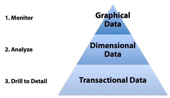
I’m referring to the MAD framework established by Wayne Eckerson in his fantastic book Performance Dashboards: Measuring, Monitoring, and Managing your Business. The MAD framework describes a three-tier system to track organizational performance:
- Monitor
- Analyze
- Drill to Detail
Starting at the top of the pyramid, we monitor using graphical, metrics data. This is the highly summarized dashboard that we typically think of. We analyze at a greater level of detail, typically with summarized, dimensional data. The data can be navigated by various hierarchies such as time or geography, or in the case of the Winter Olympics, a particular sport. Lastly, when questions arise, the MAD framework allows us to drill to detail, looking at a fine grain of information, typically a single transaction or event. It is not always necessary to examine this level of detail, but it is important to provide it so the root cause of a problem can be determined.
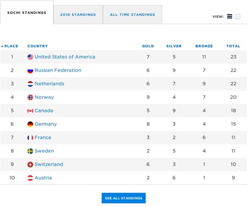
So how is this paradigm being used in Winter Olympics media coverage? I’m a big fan of the Wall Street Journal. It was one of the first news sites with a pay wall and I’ve been a subscriber since it first appeared on the world wide web. As with most news sites, the Wall Street Journal has added some interactive dashboards with updated medal statistics from the 2014 Olympic Games in Sochi, Russia. The Wall Street Journal includes an at-a-glance dashboard on its home page, number of medals by country. There is some drill-down capability, as we can look at all medals or get more information- news stories- about the event.
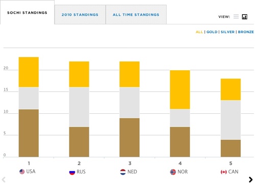
 Clicking on “more Olympics” takes the reader to a new page that still has the highly summarized medal statistics at the top but now includes a smaller dashboard in the bottom right corner (I’ve highlighted it in orange) that breaks down the medals by gold, silver, and bronze.
If the user clicks on “all medals” instead, they can examine individual countries using a geographic map.
By hovering over the country, readers can see the total number of medals compared to the Wall Street Journal’s prediction. For example, Norway had 20 medals to its credit but the Wall Street Journal is predicting a total of 33.
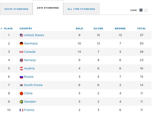
The Wall Street Journal does a great job of allowing its readers to monitor a high-level summary. And we can drill down to individual countries. But there isn’t much in the way of analysis, nor a truly fine grain of detail such as individual sports or athletes. No doubt this is partly due to the Wall Street Journal’s executive audience. Typically, executives only need to carry around a few key statistics to share at the corporate water cooler. And after all, the Wall Street Journal is a financial newspaper, not a sports publication. True Olympic data geeks aren’t looking to the Wall Street Journal to provide ways of slicing and dicing Olympic results.
Another observation we can make from online journalism is that consumerisation of business intelligence is changing expectations of what’s possible. The ability of executives and middle managers to slice and dice Winter Olympics results is changing their expectations of what they should expect from their corporate business intelligence systems. What I really like about Mr. Eckerson’s approach is that business intelligence isn’t a dashboard. It isn’t data discovery. It isn’t highly formatted reporting. Instead, it is all of these things, well integrated and capable of meeting the needs of various stakeholders from the entire organization.
Is your organization struggling to deliver this kind of business intelligence? Wayne Eckerson’s book is still my favorite “if you can only read one book about business intelligence, read this one” book. But be warned. There is no “easy” button in business intelligence. It is difficult, multi-disciplinary work. It requires a well-blended combination of business knowledge and technical expertise. It is by definition disruptive to corporate culture. And we often learn that our biggest struggles are chiefly “people” issues and not “technical” issues.
Are you following the Winter Olympics online? I’m interested in which web sites you are visiting and how they are shaping your own ideas about analytics, business intelligence, and performance management. As always, your comments are welcome.
